Smurf Tiling had the reputation. The workmanship. The crew that gets in, gets it done, and leaves a job cleaner than most people leave their kitchen. What they didn’t have was a brand that reflected any of it.
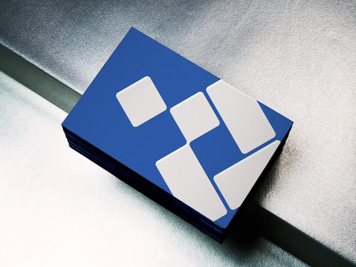
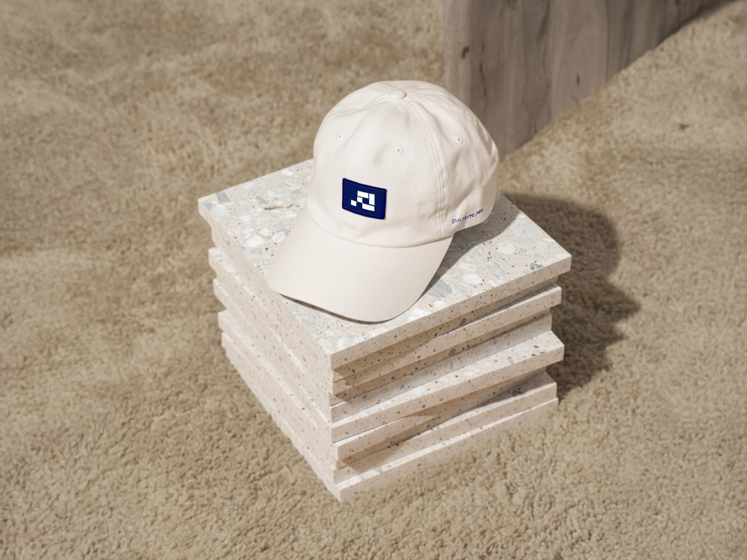
The starting point was the logo. Rather than overcomplicate it, we stripped it back and rebuilt it. A mark with grit, edge, and zero BS, something that feels solid in the hand and unmistakable on site. Clean lines, bold typography, and a colour palette designed to cut through the visual clutter of the construction industry without feeling generic or overdesigned. From there, we developed a complete brand system that could hold up everywhere - from ute signage and business cards to quotes, capability documents, and social content. Every element was designed to feel cohesive and recognisable.
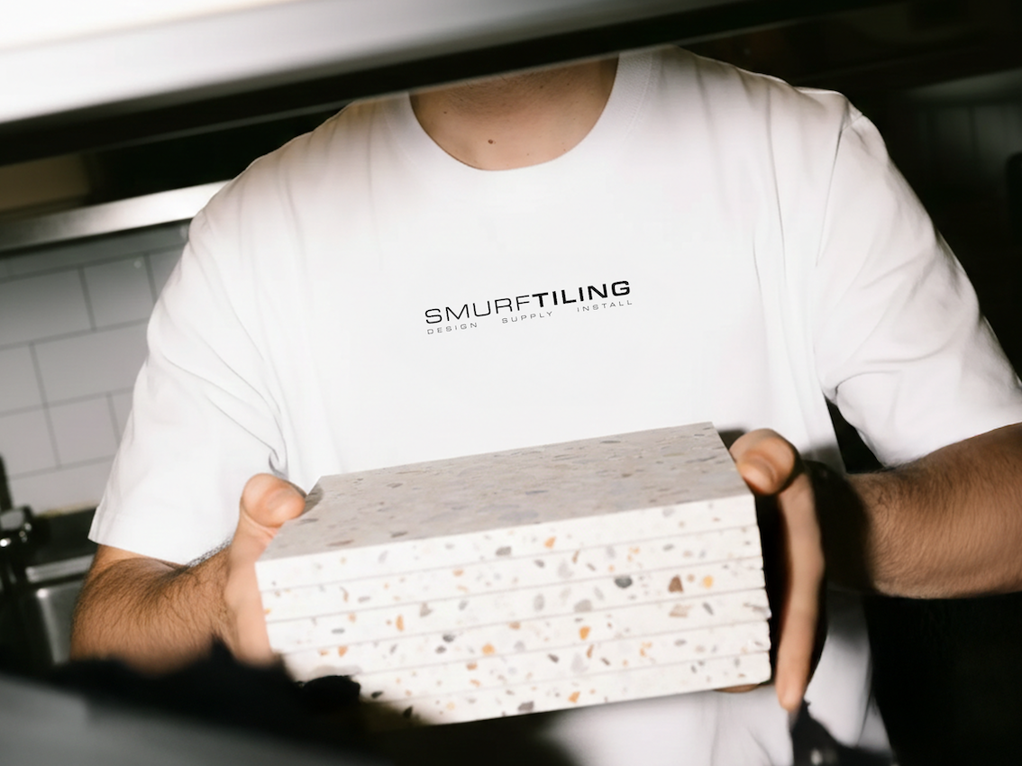
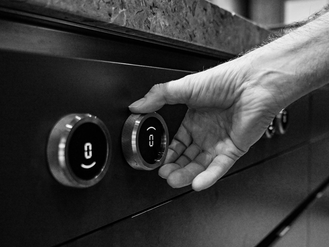
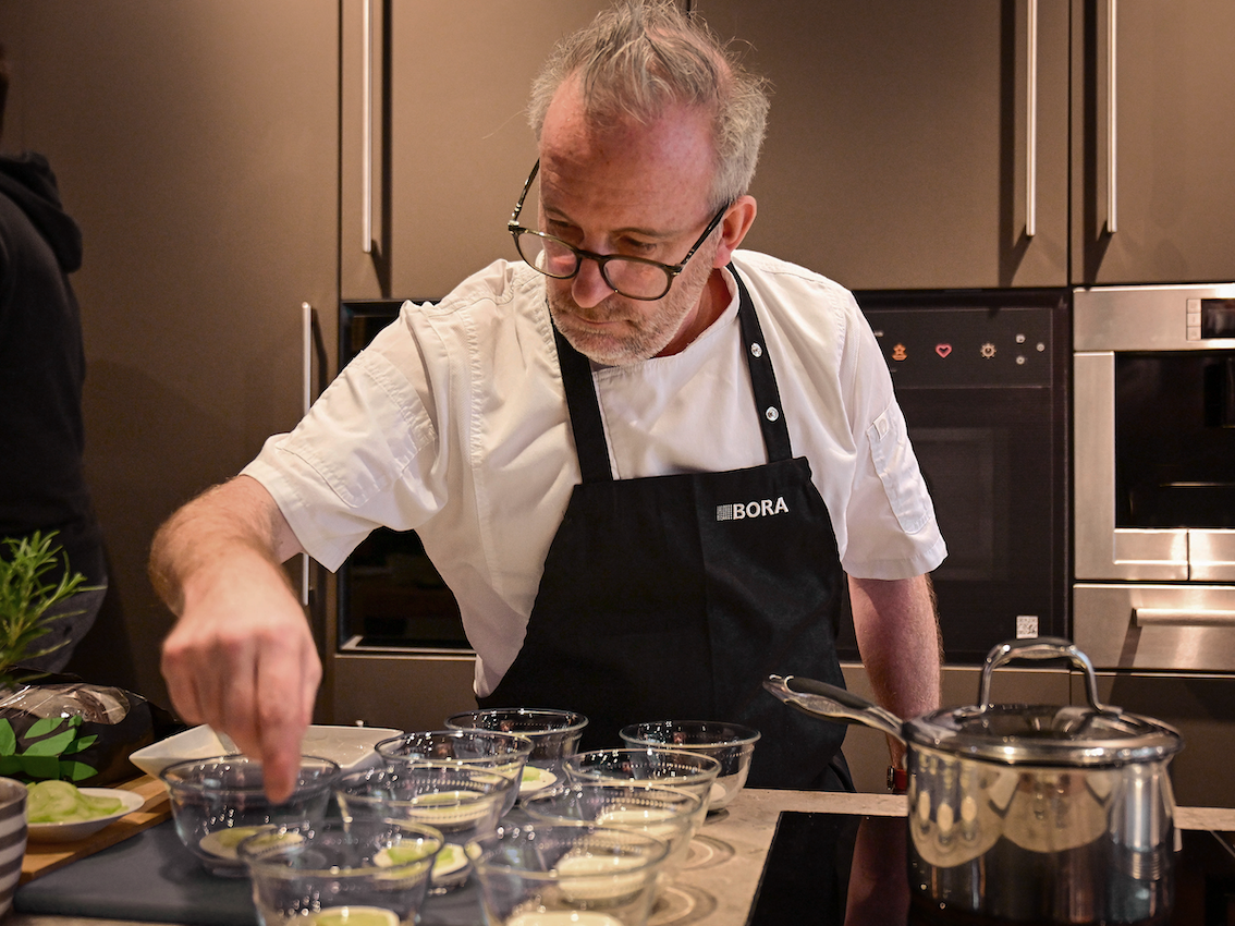
Photography played a huge role in the transformation. We moved away from staged, polished corporate imagery and focused on capturing the texture of the trade itself - tools, dust, detail, precision, and the people behind the work. The result is a visual library that feels authentic to the industry and gives Smurf Tiling a level of professionalism that immediately builds trust.
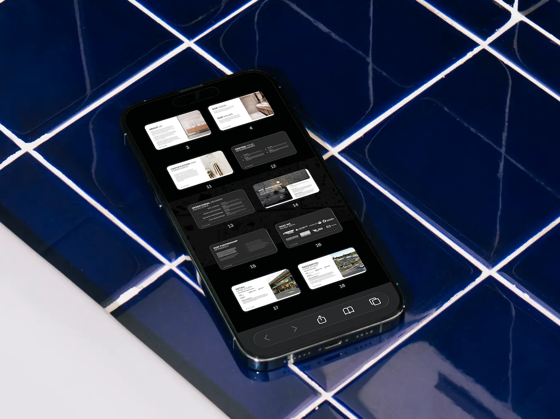
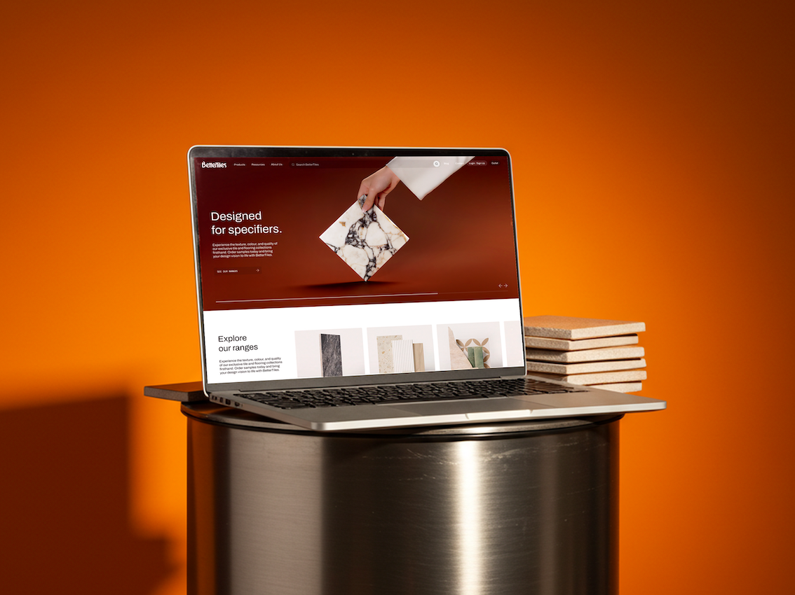
The print and marketing collateral followed the same philosophy. Bold business cards that don’t disappear into a drawer. Capability and quote documents that feel considered rather than templated. Materials designed to grab attention, communicate confidence, and reinforce the quality of the work before a single tile is laid.
This wasn’t about making Smurf Tiling look trendy. It was about making them look like what they already were: a crew built for big jobs, tight deadlines, and high standards. A brand that feels tough, looks sharp, and isn’t afraid to get a little dirty.
Smurf Tiling
2025
Branding, Photography, Print Design, Marketing Collateral